The right paint color can set the tone for a room in your house. For 2017, Sherwin-Williams has decided that tone is: restlessness. Inspired in part by evolving worldwide cultural landscapes, and in part by the idea of a renewed sense of spirituality, each of the 4 palettes in the forecast — there’s Noir, Holisitic, Intrepid, and Unbounded — is about embracing changes that we see taking place in societies around the world by embracing new ways to use color right at home.
“Our forecast this year is an exploration of the trends and influences that are emerging to drive design towards a state of restless energy,” Sue Wadden, director of color marketing for Sherwin-Williams, said in a press release. “Each of our four palettes tell a distinct color story, offering opportunities for homeowners and professionals alike to explore color in new and exciting ways.”
Here’s a closer look at each of the Sherwin-Williams 2017 color palettes…so you can stand way ahead of the trend!
Photography by: Raymond Hom
Noir
The Noir palette is all about creating a kind of modern romanticism through combining rich, dark tones with lighter colors for balance. The stars of the palette, which was inspired largely by the baroque period and classic romanticism, are the dramatic blues and the grape-esque purple. This includes, for example, Cascades, which is a deep, elegant shade of teal.
These darker hues are balanced out by a number of neutrals — you’ll see everything from a light taupe to black (err, noir) — and an unexpected, though rather royal, golden yellow.
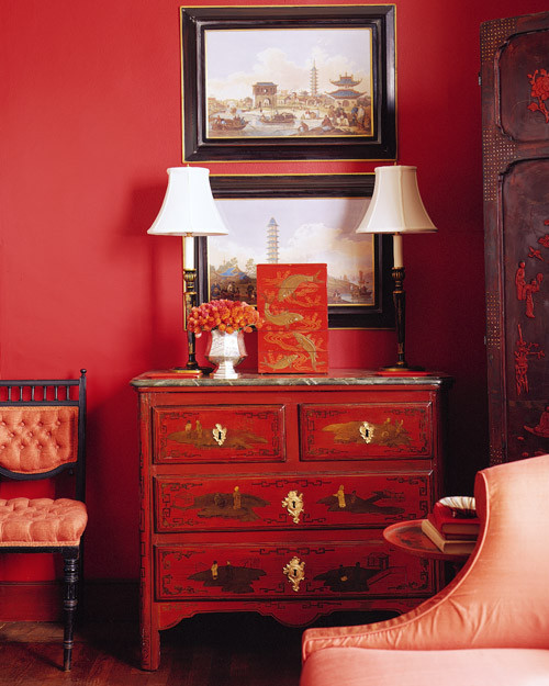
Get Tips on Decorating with Dark Colors
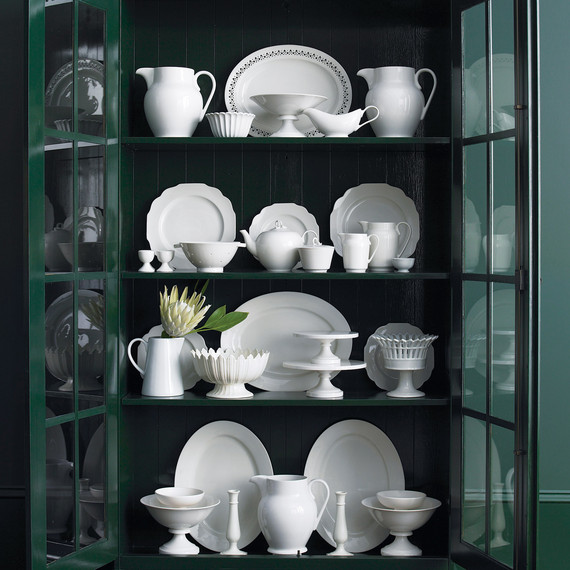
Holistic
The concept behind the Holistic palette is creating a series of colors that embody ideas of healing, serenity, and sustainability; of balance and subtle beauty. The neutral-, pink-, and green-filled palette is, as Wadden describes it, “a grown-up version of pastels” that works exceptionally well in restive spaces. It’s not hard to imagine, given the inclusion of colors like Sheraton Sage in the palette, which evokes a mellow, nature-inspired mood for any room.
Get Inspired by These Green Room Ideas
Photography by: Lisa Romerein
Intrepid
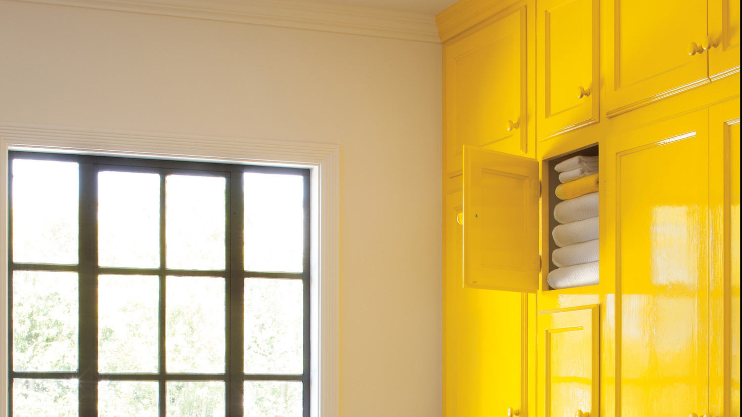
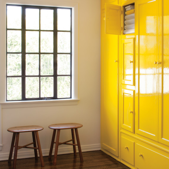
Eclectic is the name of the game with the Intrepid color palette, which includes everything from burnt orange and bright yellow hues to dark and light purples alike. The inspiration behind the rather retro palette is the energetic nature of global collaboration that we see defining societies today, along with the vibrant hunger for change that we see driving youths across the world. Needless to say, a palette inspired by such feist is sure to be a little loud, and if that’s not your style, you could always use colors like the bright yellow Citronella to highlight different parts of the room, like cabinet doors or shelves.
Get More Tips on Decorating with Bright Colors
Photography by: Jose Manuel Picayo Rivera
Unbounded
Unbounded is a color palette meant to symbolize diversity; the movement of people across the world and the cross-border connectivity that exists as a result. “This earth and spice palette tells the story of how migration is forcing cultures to mingle and share a collective ‘we,'” says Wadden. The extremely varied shades in the palette are meant to reflect that rise of an entirely new kind of shared culture by allowing you to create a look in your home that is likewise completely fresh and novel. Containing everything from the turquoise-esque Freshwater to the kind of candy apple Rave Red, any selection from this palette is sure to make a bold statement.
Get Inspiration for Using Red in Your Rooms