

Photo By: Ghislaine Viñas Interior Design
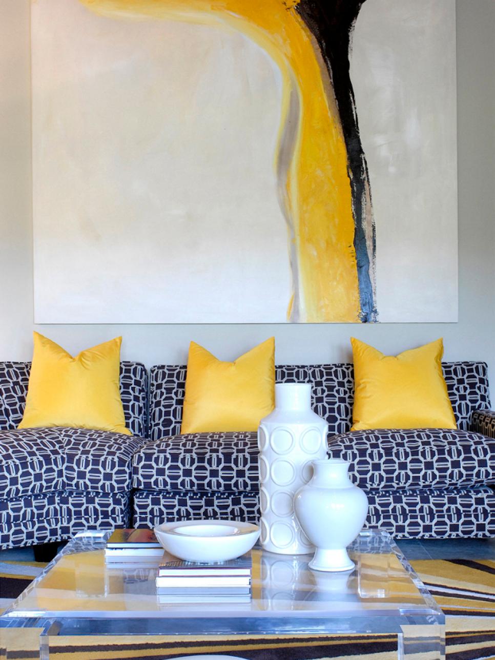
Photo By: Sam Oberter Photography
Photo By: Photographer: Michael Rodenbush
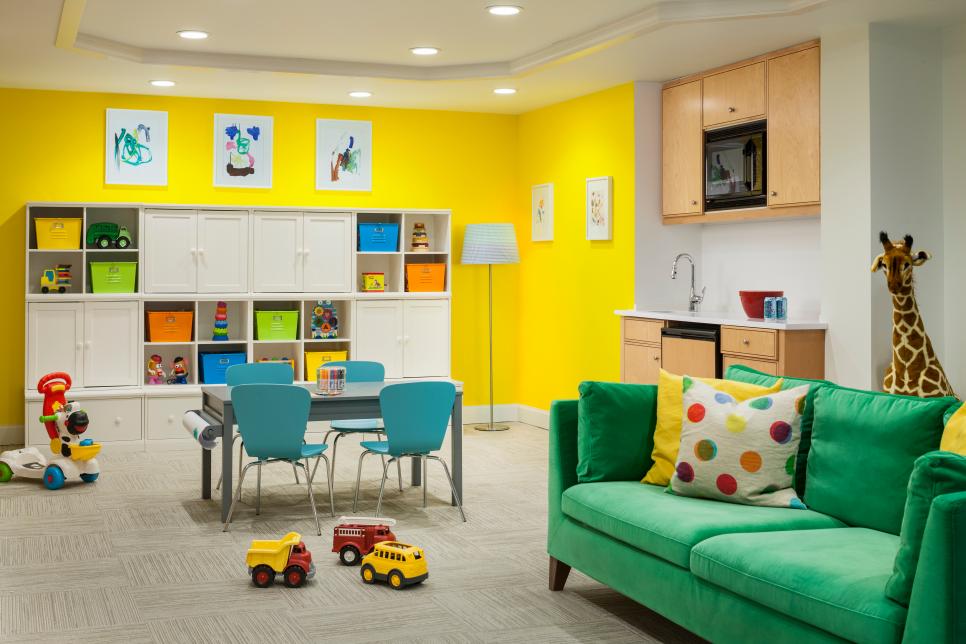
Photo By: John Granen Photography
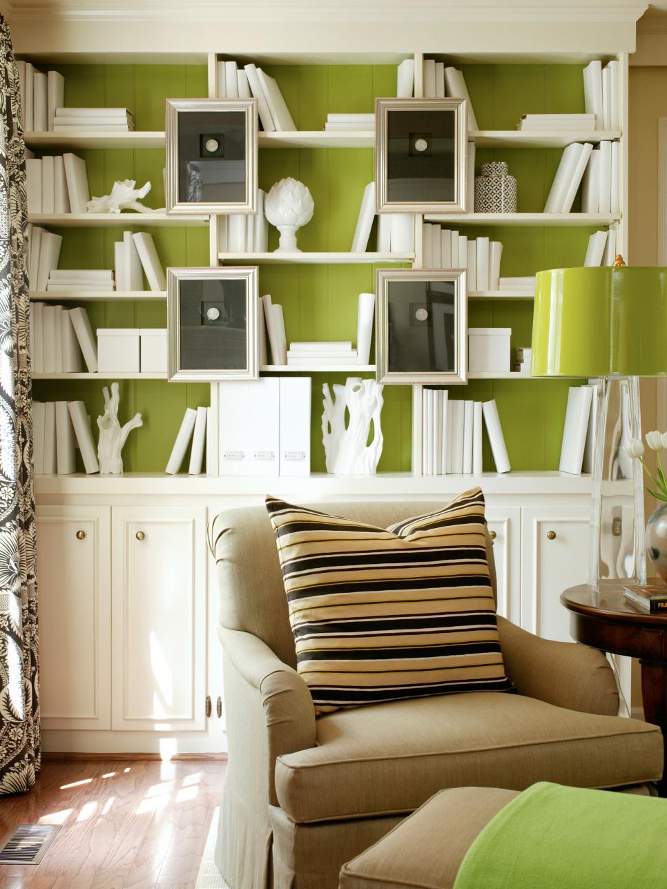
Photo By: Altell
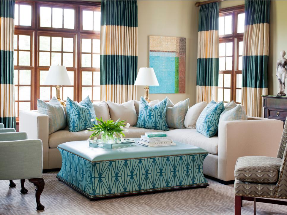
Photo By: Bronwyn Poole
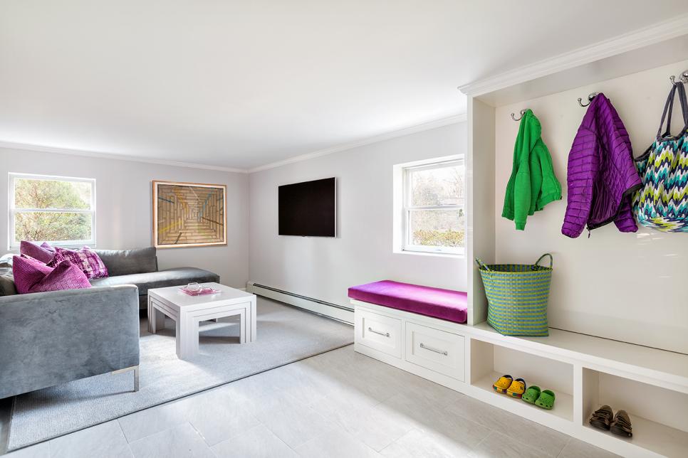
Photo By: Donna Dotan
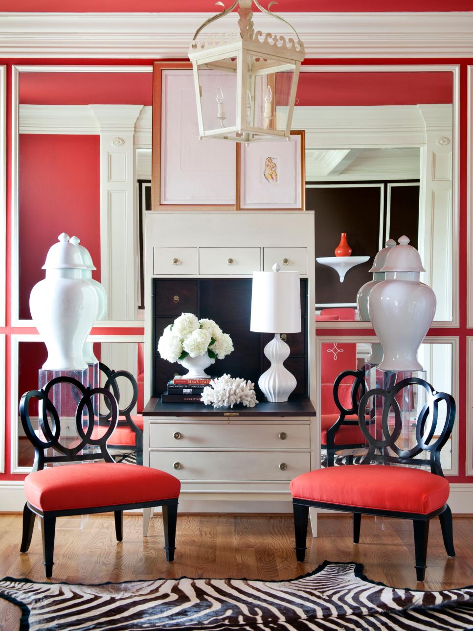
Photo By: Ball & Albanese
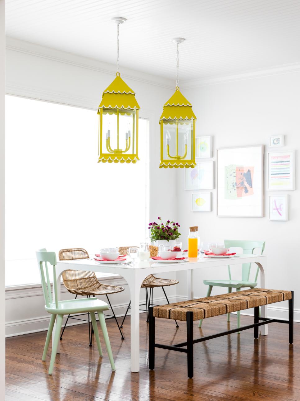
Photo By: Sean Litchfield Photography
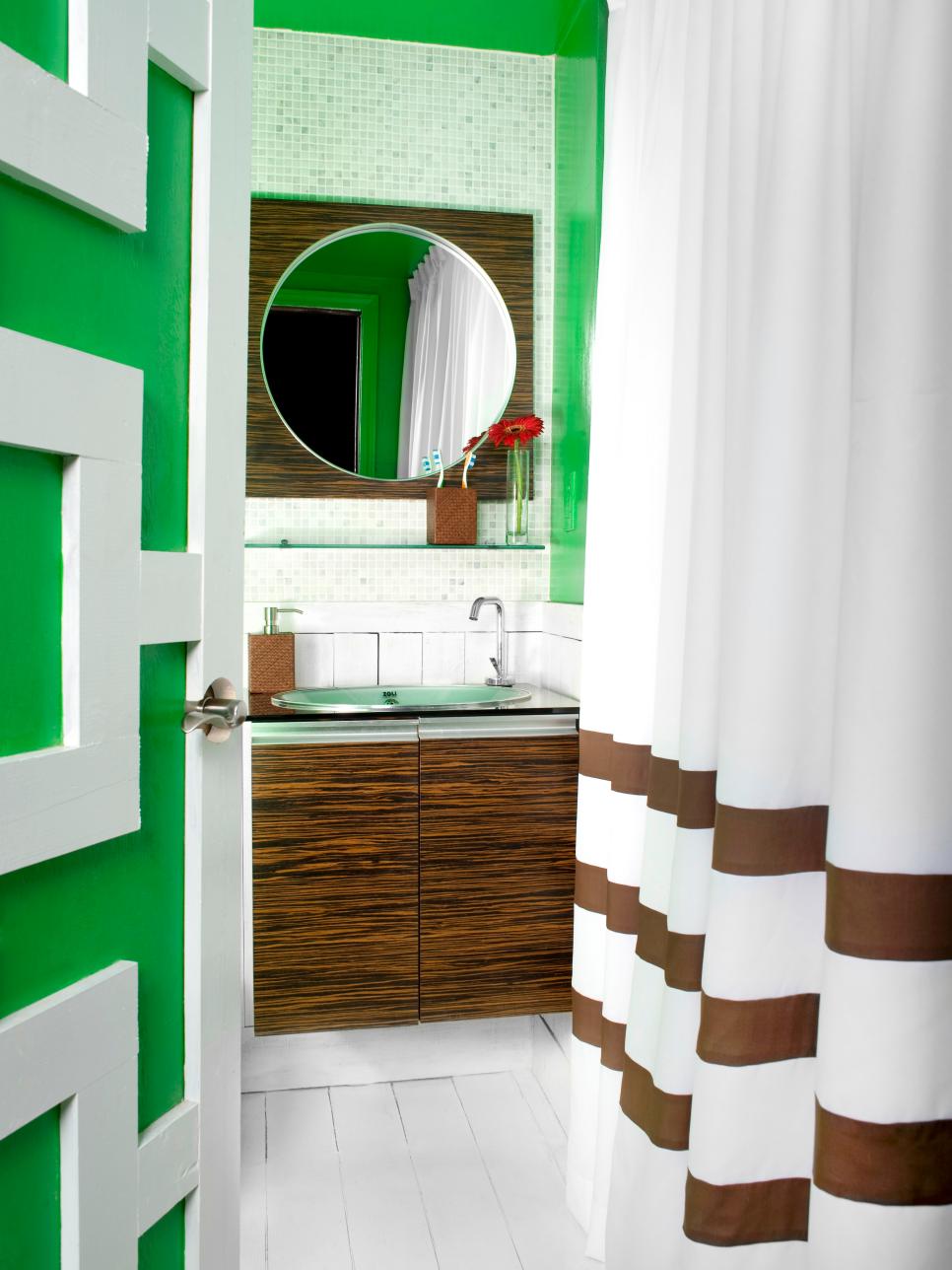
Photo By: Altell
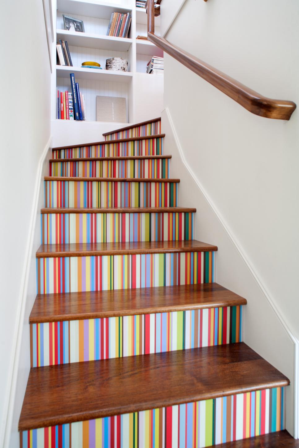
Photo By: Lee Manning Photography
The Color: Cobalt Blue
Where to Use It: Bold yet playful, cobalt blue makes a statement without feeling abrasive. Interior designer Ghislaine Viñas says the dynamic hue works great for home offices. “To get more comfortable with color, start in a small room and learn to relax and play with color,” Ghislaine says.

From:
Ghislaine Viñas Interior Design
The Color: Exotic Orange
Where to Use It: Vibrant orange is an instant energizer in any space. Ghislaine says the color works well when you’re seeking a warm feel but want a punchy impact. If an orange sofa is out of your comfort zone, opt for a small accent wall in the zingy hue. A wall decal is a great way to get a temporary taste of this exciting color.
From:
Ghislaine Viñas Interior Design
The Color: Sunny Yellow
Where to Use It: Hello, yellow! This bright, happy color can’t help but bring a smile to your face. Artwork and accent pillows are two simple ways to let the “sunshine” in to your room. To make the color pop even more, pair it with a soft neutral, such as gray or white.
The Color: Soft Gray
Where to Use It: Interior designer Anastasia Faiella deems this dreamy shade of gray both classic and versatile. Bathe your kitchen or living room in the hue, or create a bedroom retreat with the calm, breezy color. “I love that so many other colors work perfectly with gray and how it can go cool or warm,” Anastasia says. Its fresh feel and look make it an easy choice for summer.
The Color: Sky Blue
Where to Use It: Just like the sky itself, this shade of blue has a serene, calming presence. “I like to use it in healthy doses on furniture, drapery panels and large accessories,” says interior designer Tobi Fairley. It can bring the same quieting effect to a bedroom, sitting room or any space where you like to relax and unwind.
From:
Tobi Fairley
The Color: Candy Apple Red
Where to Use It: Sparking memories of freshly-candied apples at old-fashioned fairs, this shade of red is perfect for a dining room. “Choosing a non-primary red is much more attractive to our eyes, as it is complex,” explains architect and designer Alan Metcalfe. Alan says the powerful hue stimulates appetite, productivity and passion.

From:
Alan Metcalfe
The Color: Crisp White
Where to Use It: Like laundry draped across a clothesline, a brilliant white can give any space a fresh, clean look. Use white as a neutral backdrop, and then accessorize with accent pieces in your favorite colors, or create a monochromatic design by enveloping the room in an all-white palette.
The Color: Seaworthy Coral
Where to Use It: As one of the sea’s most vibrant hues, coral is a standout shade no matter where you use it. Accessories are a natural fit for this accent color, whether it’s a pillow sham or a throw for the foot of the bed. For a bigger statement, why not add an unexpected twist by pairing this punchy color with white for a striped ceiling?
The Color: Neon Yellow
Where to Use It: The ultimate mood-lifter, neon yellow is trendy, exuberant and full of summer cheer. “While an entire accent wall of neon yellow might not be for everyone, it’s certainly one way to add a punch or wow factor to your room,” says interior designer Kimberlee Gorsline. “For those that want just a touch of neon yellow, consider working it in with your accents — think pillows, vases, artwork and lamps.”

From:
Kimberlee Gorsline
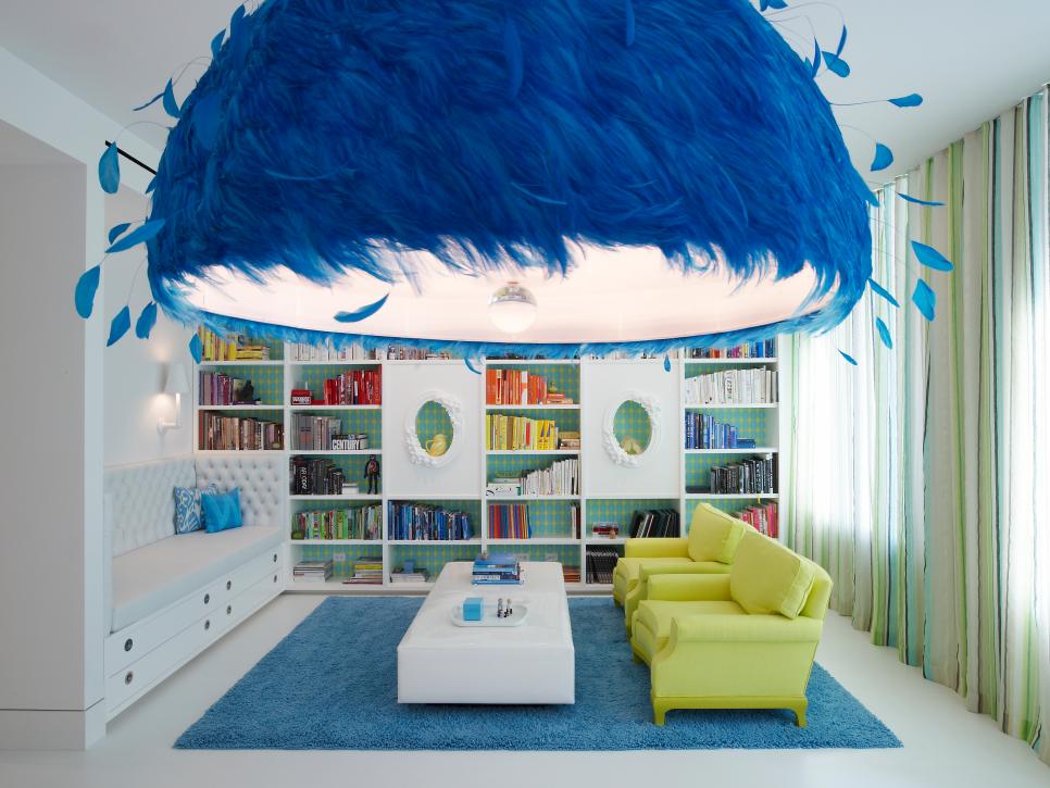
The Color: Refreshing Lime
Where to Use It: You know how a hint of lime makes everything – from salsa to a cocktail – just a bit better? The color can have the same effect on a room. Use it as a highlight accent, like the bookcase backdrop shown here, then bring in smaller accessories in the same color to complete the look.
From:
Tobi Fairley
The Color: Water’s Edge Blue
Where to Use It: No matter where you live, nothing is as inviting as a cool body of water on a summer day. Get the same feeling in your living areas by immersing the room in this cool shade. For a dramatic effect, use the color on upholstered pieces, drapery panels and accessories.
The Color: Tropical Pink
Where to Use It: Combine a touch of sweetness and a splash of sass, and you’ve got this fabulous shade of pink. “Hot pink is always a great color to add impact and spice to a space,” says interior designer Bronwyn Poole. “It’s not as polarizing as baby pink and easily tones with other colors.” Bronwyn suggests sourcing a textile that has tropical pink as the base cloth with a multicolored print on top.

From:
Bronwyn Poole
The Color: Brilliant Magenta
Where to Use It: This vivid color embodies the happy, carefree feel of the summer months. “Using a color this intense is easy, but you have to use it sparingly,” says interior designer Claire Paquin. “If you decide to use it more boldly, for example on drapes or seating, you need to make sure it’s also spread around the room and doesn’t come out of nowhere.” Claire also suggests using magenta outdoors to complement and enhance lush summer greenery.

From:
Claire Paquin
The Color: Nail Polish Red
Where to Use It: What better place to make a statement than your entry? Not only does this room set the tone for the rest of the home, it entices guests to want to see every room of the house. A cheerful red is inviting and happy, like the smile of the friend who welcomes you.
The Color: Nature-Inspired Neutrals
Where to Use It: Use neutrals inspired by nature’s soothing colors to bring a breath of fresh air to your home’s most lived-in spaces. Incorporate natural or weathered wood into your design for an organic feel. “Neutrals are timeless and beachy,” says Susana Simonpietri, creative director of interior design firm Change & Co. She recommends using neutral-hued linen and cotton fabrics for the summer.

From:
Chango and Co.
The Color: Cheery Chartreuse
Where to Use It: A splash of chartreuse in a light-filled room is like a juicy scoop of sherbet on a sunny summer day. Susana says chartreuse works best when used sparingly. “Try it on accents: pillows, throws and light fixtures,” she suggests.
From:
Chango and Co.
The Color: Kelly Green
Where to Use It: Mimicking the color of verdant summer foliage, Kelly green is full of life. “The color mixes well with other summer hues like blue, pink and yellow, so it’s a great fit for the season,” says interior designer Brian Patrick Flynn. He recommends pairing the bold hue with plenty of white and lots of natural light, so it reads true to its values.

From:
Brian Patrick Flynn
The Color: Nautical Navy
Where to Use It: If you follow fashion trends, you may have noticed navy is one of the hottest “new neutrals.” Just like black, white and gray, navy can create a statement without overpowering a room. Pair it with bold colors, such as red or pink, to create style-setting combos. Want to follow the nautical trend? Consider using it in a striped pattern like the rug shown here.
The Color: Flirty Pink
Where to Use It: We all know pink is the ultimate girl color — nothing else can give a room a feminine touch like this blushing hue. That’s what makes it the perfect choice for a girl’s bedroom. Highlighting different shades in a floral fabric and pairing it with purple only intensifies its playful appeal.
The Color: Fresh-Squeezed Orange
Where to Use It: Whether it’s juice from a roadside stand or cool sherbet on a hot day, orange has long been the color of summer. For a quick spruce-up, add orange or tangerine throw pillows to a neutral couch. If you’re a true fan of the juicy color, add statement pieces such as painted side tables or a sideboard.
The Color: Multicolor Madness
Where to Use It: Why choose just one color when you can have them all? Embrace a vibrant multicolor pattern to instantly freshen up a dull space or make a mundane activity a little more exciting. Here, architect and designer Jeff Troyer used striped wallpaper to enliven classic stair risers. “It’s easy to clean and easy to change down the road,” Jeff says.

From:
Jeff Troyer Associates
SOURCE:http://www.hgtv.com/design/decorating/color/top-10-summer-colors-and-how-to-use-them-pictures